Showing posts with label desks. Show all posts

16.4.12

A Hunting


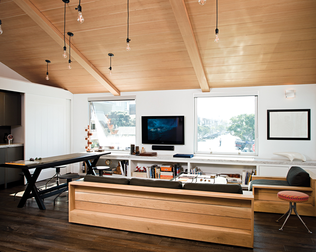
What I wouldn't give for that desk. OK. I probably wouldn't give a child, or the deeds to the Splendour, or my car....but, I would happily give a great deal to my hands on that desk.

I really need to spread out a bit more, and look at the size of that treasure. And apart from the proportions the clean lines are v.cool. 

OK, new target for the week found. A hunting we shall go.

Images from fri

15.8.11

Setting Up


I love the study in this home, and the amazing MCM wall unit. These wall units have been on my mind a lot lately.

You see I'm planning on setting up my office space in my new home in an area currently used for a dining table. It's all open plan onto the formal sitting room, so I'm kind of wrangling with how to have an office (a.k.a. messy space) with a formal sitting room (a.k.a. not really that formal, but a grown up space, no PSP's allowed).

And these wall units are a very grand idea. Lift the flap and hey presto messy space vanished. The only problem is they're not really big enough for spreading out plans and paper work for late night "shit! is that meeting tomorrow?!"sessions.

Have you got a favourite office-on-show space? Please share. Inspiration is needed.

Images from dwell

23.5.11

Deservedly


I'm particularly loving the blue and green hues that this place is showing off. But with it's zebra skin, gilded Italian tole, cream vintage tolix and lovely art and books galore, it seems showing off comes naturally. Deservedly so.

Images from nuevo estilo

11.5.11

Subtle Dash


Loving the way the owners of this home accessorise. The subtle dash of orange in a grey, black, white living room is just enough. Not too much, not too little.

And some other serious accessorising detail love goes to the blingage on the dress form and that awesome canvas of Elizabeth Taylor in the little girl's room. That's a genius idea.

Images from vogue

12.11.10

Poignant Reminder


This is the fabulous home of designer John Minshaw. Herein lies a brilliant example of his style. Clean, architectural, classic with a twist.

I like the way his rooms are beautifully edited and a poignant reminder of less is more.

Images by clive nichols

6.10.10

Closely Resembles


That first image very closely resembles what I call perfection. If you've been a reader here for a while, you'll know I have a soft spot for a black wall or two, particularly in the bedroom. But I must confess, that soft spot goes off the charts altogether when matched with a statement bed cover like this one above.

However great design does not rest its laurels on one spectacular room alone, and on that score this place doesn't disappoint. Gorgeous layers of white, charcoal and natural tones.

Images by véronique mati via elle

25.6.10

Perfect Trilogy


So many details here that I find very easy on the eye. The consistent black injection, the gobsmackingly lovely collections of vintage art and tables, and the inlaid stools are right up there in the 'phwoar' stakes for me.

But the detail that I've taken from this home (and one that you really don't need a gorgeous building and furniture to pull off) is the black and white ticking that's been used as a bed skirt. Cheap, easy and stylish - a perfect trilogy.


Images from here
Related Posts with Thumbnails