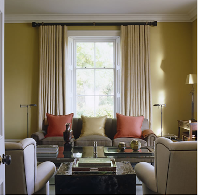
I showed you the gorgeous home of designer John Minshaw the other day and I thought a bit more of his work might be in order. This is one of his projects, and it has all of the hall marks of his genius editing.
I particularly like the way he layers colour. What a master. I also love that simple treatment in the twin bedroom, the matching fabric to the walls also used as simple over blankets at the end of the bed is incredibly luxurious but beguiling robust in wool.
But the real heart melter for me is the first image. So subtle but so potent. The light could not be more perfect for the room.
Images via John Mincherton


7 comments:
The bathroom is spectacular!!
I love the room with the grandfather clock. I love the slope of the ceiling.
Megan
Such restraint! Only the most exquisite pieces.. he must be a follower of William Morris :) Beautiful pics, as always..
It's so pristine and perfect. Very lovely. xx
love those mirrored vanity doors! The clean lines call to me and I appreciate how they reflect that gorgeous marble floor.
Hope you are feeling better :)
Naomi
This is super interesting, I really like it.
xoxo
I like that there is hardly anything on the walls. Just a bit of art here and there.
Post a Comment