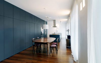
I love the way this big open space has been treated. The relatively inexpensive charcoal board lifts the look of this place from bland to sensational just with its simplicity, application and consistency.
Just goes to show it doesn't matter how much you spend, its how cleverly you use the money you have!
Images from at casa


10 comments:
Yes, sensational is the right word. Beautiful!
So true...Its all about the way you do it...I love this space!
Wish you a fantastic morning:)
Kisses,sweetie
Definitely! And is that a pantry closet? So bright and huge!
Now that is my dream pantry - I could even shove the kids in there when they are messing the place up...would have to sound proof it though.
Wow, that's amazing! Very brave design, I love the charcoal. And as for the Saints..I nearly died last year, I nearly died this year.. what will happen to me this week?! GO SAINTS! Rachaelxx
You're so right. It really makes the space incredibly interesting. Fantastic!
Jules, you + me + slate black = happiness forever! Love it, you find the best pics! XX!
Amen to that! I love the slate black! Those antique pieces are gorgeous too!
Um....and that pantry?! wow....hope you are having a beautiful start to your week darling darl! :)
xo
Melis
I think this is the most storage I've ever seen! Apart from a storehouse of course. Love the black very much.
Post a Comment